Introduction
Purpose of the visual identity
The purpose of the visual identity is to create a clear and recognizable expression for Betek.
By using the same visual principles across all platforms and materials, we build a stronger brand and ensure that Betek communicates with clarity, confidence and consistency.
Betek gives installers in EL-PROFFEN a competitive advantage.
Through products designed for installation, close collaboration with professionals, and solutions that work in practice, we make everyday work simpler, faster, and more profitable.
Our values
Built for the installer
We develop products for the people who actually use them. With a focus on easy installation, smart solutions, and fewer frustrations, our products are made to perform where it matters most – on the job.
Trust
We deliver on our promises. Our products are made to perform as expected, and we strive to be a supplier installers can rely on – every time.
Creating value in everyday work
We aim to make the workday simpler, more efficient, and more profitable. Our solutions are designed to improve workflow and reduce friction in every project.
Primary logo
The Betek Norge logo is available in Betek Green, black and white. The green version should be used whenever possible.
On dark or green backgrounds, the white version may be used to ensure sufficient contrast and maintain clear visibility.
The black version should only be used in situations where color reproduction is not possible.
Secondary logo
The secondary logo should be used in situations where the audience may not yet be familiar with the Betek Norge brand. It provides clearer identification and helps communicate who Betek Norge is.

Safe area
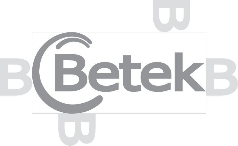
To maintain clarity and visibility, the logo must always be surrounded by sufficient clear space.
The minimum clear space is defined by the height of the “B” in the logo. No other elements, text, images or graphics may enter this area.
Examples of wrong use
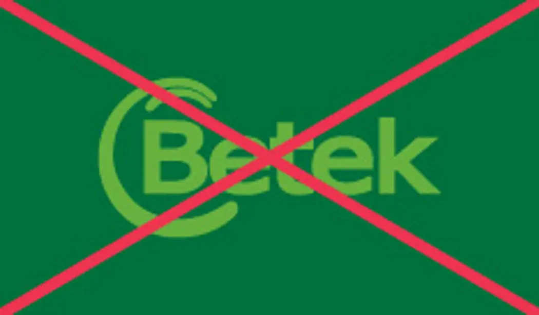
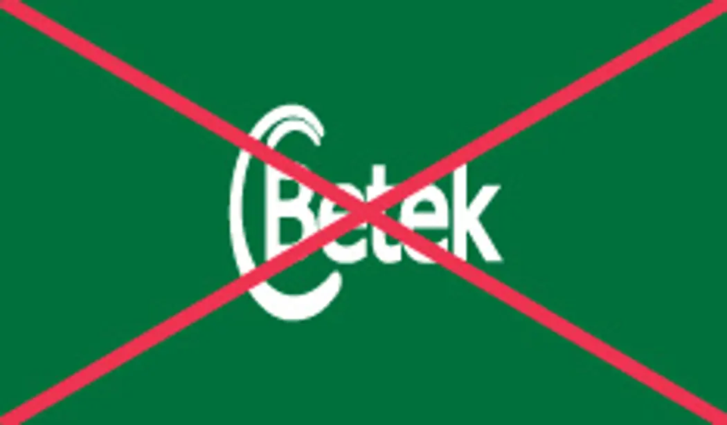
Always ensure there is enough contrast in relation to the background. Avoid using the logo on top of images with chaotic elements. Do not stretch, distort or change the shape of our logo in any way. Do not use the logo in other colors then the ones outlined in this manual, and do not add any effects such as shadows or glow to the logo.
Colors
The color palette is mainly made up of shades of green, with our primary color being Betek Green. The supporting shades of darker and lighter green helps with variation and balance when creating more intricate graphics for the brand.
Black and white is used for text, depending on the color of the background. It is important to ensure readability, so as a guiding principle, white should be used for all text on green backgrounds.
The most common color-code we use when we want to copy-paste into any office programme is HEX.
Palette
- Green
- CMYK: 100/0/91/42
- RGB: 0/112/60
- HEX: #00703C
- PMS: 348 C
- Dark Green
- CMYK: 100/0/64/88
- RGB: 0/46/31
- HEX: #002e1f
- PMS: 627 C
- Light Green
- CMYK: 61/0/100/8
- RGB: 102/177/63
- HEX: #66b13f
- PMS: 369 C
- Light Yellow
- CMYK: 0/0/40/0
- RGB: 255/249/174
- HEX: #fff9ae
- PMS: 601 C
- Light green
- CMYK: 4/0/2/3
- RGB: 238/247/242
- HEX: #eef7f2
- PMS:
- Light Gray
- CMYK: 0/0/0/5
- RGB: 241/242/242
- HEX: #f1f2f2
- PMS:
- Black
- CMYK: 60/20/30/100
- RGB: 0/5/11
- HEX: #00050B
- PMS: Black 6 C
- White
- CMYK: 0/0/0/0
- RGB: 255/255/255
- HEX: #ffffff
- PMS:
Icons
To ensure a consistent visual identity across all platforms, all icons must use the standard settings outlined below. Icons are sourced from Material Design Icons and should not be modified unless specifically required.
Standard Settings
- Icon size: 64 px
- Icon color: Black
- Rotation: None
- Flip: None
- Style: Default (Reset Style)
- Preferred file format: SVG
Guidelines
- Always use the SVG format for digital applications whenever possible.
- Use the standard icon color unless another color is explicitly defined in the design manual.
- Do not rotate, flip, stretch, or otherwise modify icons.
- Maintain consistent icon size and styling across all products, documents, and digital platforms.
Typography
Our typography is how we present ourselves to each other and to the world, and it is essential to keep a consistent system to ensure the brand is always recognisable.
Plus Jakarta Sans is a Google Font, which means it's free to license and download. It can be downloaded from the button to the left, or from Google: https://fonts.google.com/specimen/Plus+Jakarta+Sans
Plus Jakarta Sans
Download fontsOur brand font is Plus Jakarta Sans, a modern sans serif with high readability and clear and consise lettering.
For large headings, we use Semi-Bold. For regular headings, we use Medium, and for regular sized copy we use Regular. Bold can be used to emphasize small headings.


Graphics
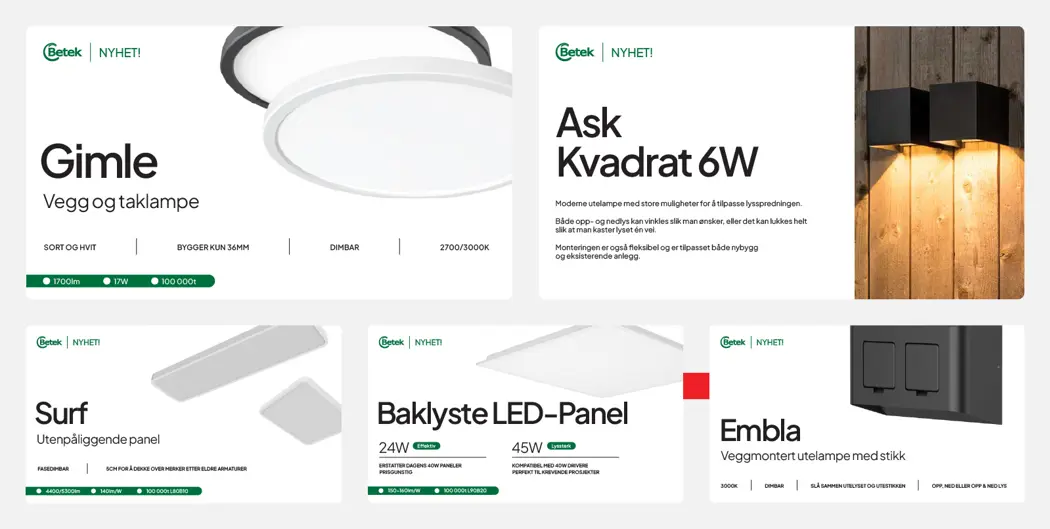
We always have the products in focus in our graphics when promoting them.
When showing product photography, the background should always be white, and the product name must be readable and easy to recognise. The graphical elements should be minimal, and only be used when necessary.
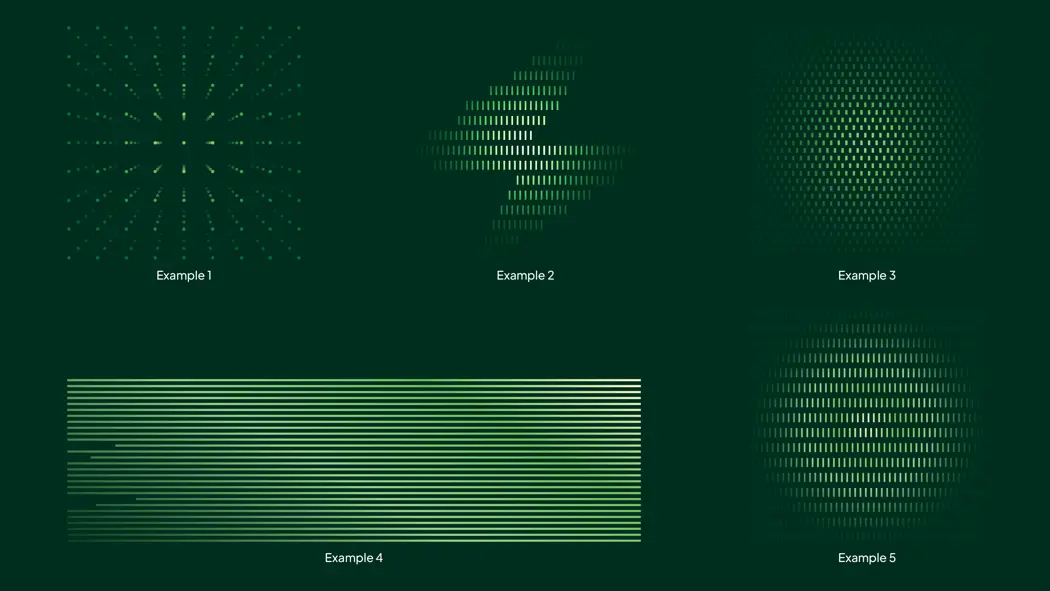
For showcasing Betek as a brand, green is the main color. There is a variety of graphical elements available, using gradients from our color palette. They are available for download in .png format.
Product advertisement
Graphical elements
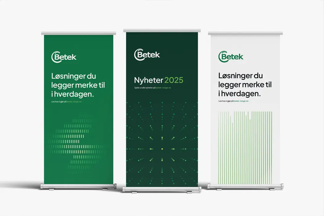
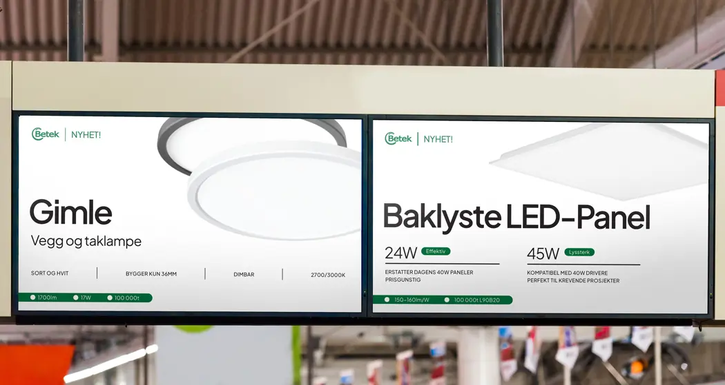
Brand in use
Below are examples of the brand in use in different outlets, both digital and print. These can be used as inspiration when creating new designs related to the brand.
Transportation
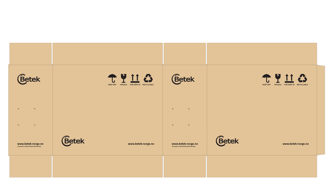
Regular shipping carton
The approved carton layout shall be used as the reference for all Betek shipping cartons. All artwork must scale proportionally to the carton size while maintaining the same visual relationship between elements.
Main Panels
Shipping Symbols
- Position: Upper right corner.
- Right margin: 10% of panel width.
- Top margin: 10% of panel height.
- Total symbol row width: 32% of panel width.
Symbols shall always appear in the following order:
Keep Dry → Fragile → This Side Up → Recyclable
Betek Logo
- Position: Lower left corner.
- Left margin: 10% of panel width.
- Bottom margin: 10% of panel height.
- Logo width: 20% of panel width.
Website
- Position: Lower right corner.
- Right margin: 10% of panel width.
- Bottom margin: 10% of panel height.
- Text width: 18% of panel width.
Side Panels
Betek Logo
- Position: Upper left corner.
- Left margin: 10% of panel width.
- Top margin: 10% of panel height.
- Logo width: 20% of panel width.
Shipping Label Area
- Position: Directly below the logo. Left aligned with the logo.
- Width and height: 15% of panel width, minimum XXxXX.
Reserved for shipping and warehouse labels only.
Website and Address
- Position: Lower left corner.
- Left margin: 10% of panel width.
- Bottom margin: 10% of panel height.
- Text block width: 20% of panel width.
Long shipping carton
The approved carton layout shall be used as the reference for all Betek shipping cartons. All artwork must scale proportionally to the carton size while maintaining the same visual relationship between elements.
Main Panels
Shipping Symbols
Position: Upper right corner.
Right margin: 8% of panel width.
Top margin: 10% of panel height.
Total symbol row width: 12–15% of panel width.
Symbols shall always appear in the following order:
Keep Dry → Fragile → This Side Up → Recyclable
Betek Logo
Position: Lower left corner.
Left margin: 3% of panel width.
Bottom margin: 10% of panel height.
Logo width: 8–10% of panel width.
Product Information Area
- Position: Centered on panel.
- Size: 15% of panel width, minimum XXxXX.
Reserved for shipping and warehouse labels only.
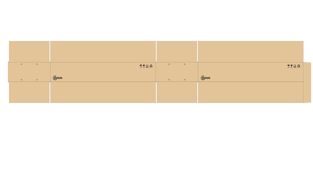
Side Panels
Shipping Label Area
- Position: Centered on panel.
- Size: 15% of panel width, minimum XXxXX.
Reserved for shipping and warehouse labels only.
Betek Logo
Position: Lower left corner.
Left margin: 10% of panel width.
Bottom margin: 10% of panel height.
Logo width: 25% of panel width.
Labels installation products
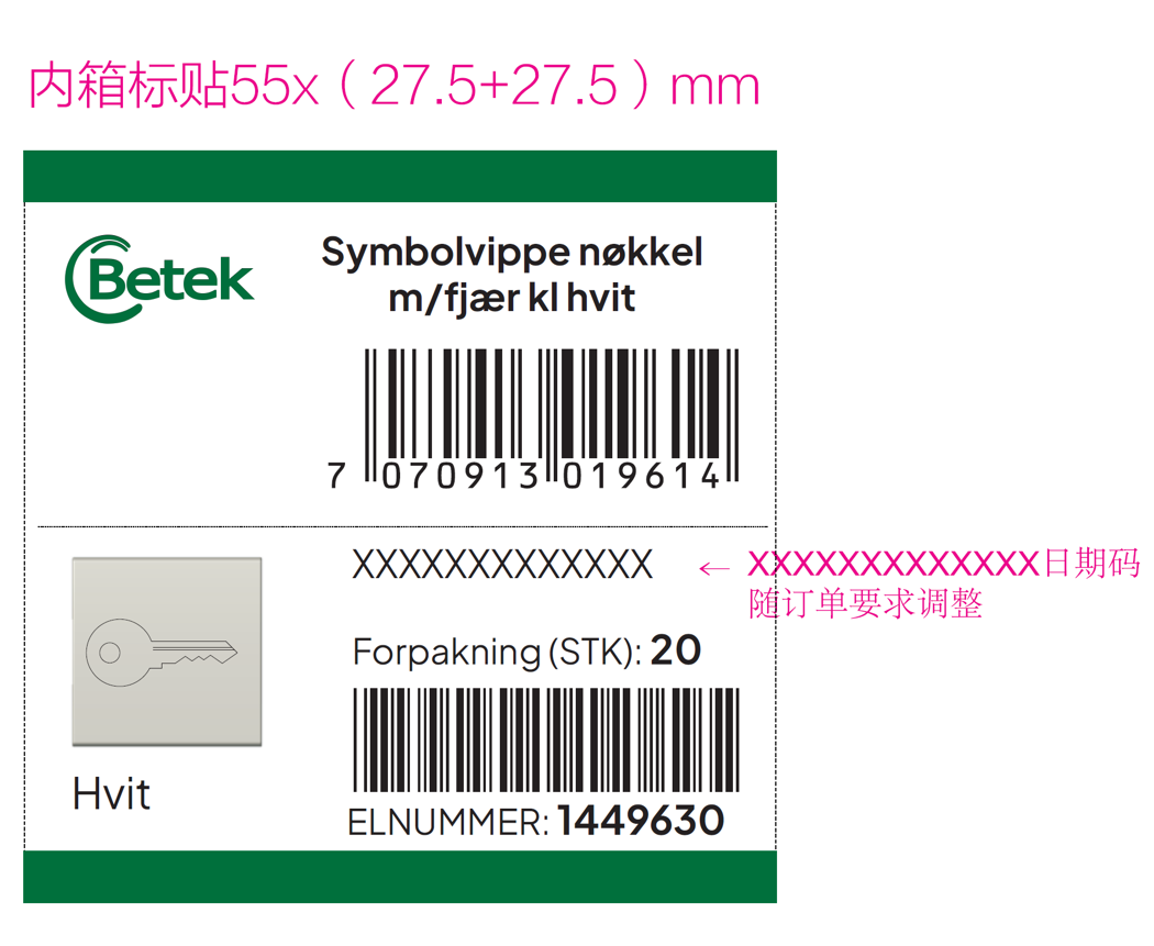
Carton label template showing product information, barcode, product image, colour, pack quantity and EL number. Product-specific details will be adjusted for each item.